How do I use an account's summary report?
To view a predefined report summarizing the financial activity in an account, select the account in the source list, then click the  button above the account register or choose Account > Show Summary Report. The report view will appear onscreen:
This report, like the overview report in the source list, is not customizable. To create reports that can be modified for specific purposes, see About Reports.
Interpret the summary report for checking, cash, and line of credit accounts
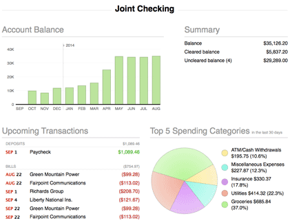
Account balance
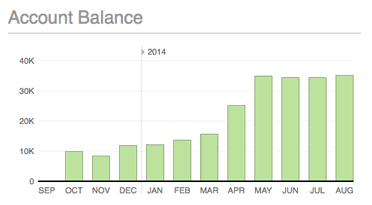
The monthly balance of the account is shown here as a bar chart. Each bar indicates the value of the account on the last day of the month in question. Hover the mouse over a bar to view the month, year, and balance it represents. The number of months displayed will vary depending on the width of the main window.
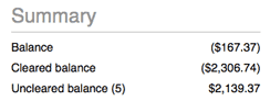
Summary
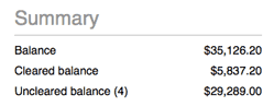
A table is shown here with three figures that summarize the account's value:
- Balance: The total value of all transactions in the account.
- Cleared balance: The total value of transactions in the account that have their status set to "cleared" or "reconciled."
- Uncleared balance: The total value of transactions in the account that have their status set to "uncleared." The number of uncleared transactions in the account is shown in parentheses.
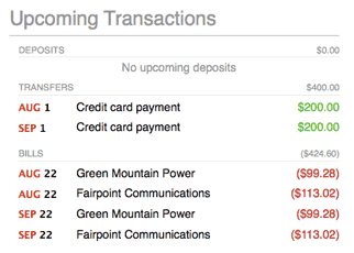
Upcoming transactions
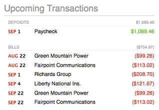
A table of upcoming scheduled transactions is shown here with transactions grouped into deposits, bills, and transfers. The due date, payee, and amount is displayed for each transaction. All transactions that are due within the current month and next month are shown.
Transfers to loan, credit card, and line of credit accounts are listed under "Bills." All other transfers are listed under "Transfers."
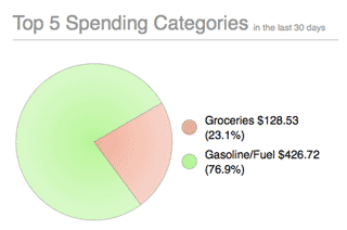
Top 5 spending categories
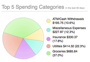
A pie chart is shown here depicting the five categories in which the most spending was recorded during the last 30 days. To the right of the chart, a legend shows the color associated with each category, the total value of the transactions assigned to the category (displayed as a positive number), and the percentage represented by that amount (relative to the five categories shown).
Interpret the summary report for savings, money market, asset, and liability accounts
The report for these account types is similar to the report for checking, cash, and line of credit accounts (see above), but the "Top 5 spending categories" section is not included.
Interpret the summary report for credit card accounts
APR
To the right of the report title is shown the credit card's Annual Percentage Rate (APR). This figure can be modified in the account inspector next to "Int. rate."
Monthly charges and payments
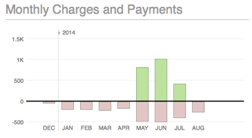
A bar chart is shown here depicting monthly charges and payments on the credit card. For each month, the total value of charges is shown in red below the x axis, while the total value of payments is shown in green above the x axis. Hover the mouse over a bar to view the month, year, charge amount, and payment amount it represents. The number of months displayed will vary depending on the width of the main window.
Summary
A table is shown here with three figures that summarize the credit card's value:
- Balance: The total value of all transactions in the account.
- Cleared balance: The total value of transactions in the account that have their status set to "cleared" or "reconciled."
- Uncleared balance: The total value of transactions in the account that have their status set to "uncleared." The number of uncleared transactions in the account is shown in parentheses.
Upcoming transactions
A table of upcoming scheduled transactions is shown here with transactions grouped into deposits, bills, and transfers. The due date, payee, and amount is displayed for each transaction. All transactions that are due within the current month and next month are shown.
Transfers to loan, credit card, and line of credit accounts are listed under "Bills." All other transfers are listed under "Transfers."
Top 5 spending categories
A pie chart is shown here depicting the five categories in which the most spending was recorded during the last 30 days. To the right of the chart, a legend shows the color associated with each category, the amount spent, and the percentage represented by that amount (relative to the five categories shown).
Interpret the summary report for loan accounts
Payoff date
To the left of the report title is shown the date on which the final loan payment is expected to be paid.
Total payments
To the right of the report title is shown the total number of payments remaining, as well as the total value of these payments, including principal, interest, fees, and any additional payment items.
Remaining
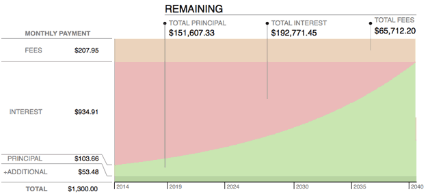
An area chart is shown here depicting all remaining loan payments. Time is plotted along the x axis while the y axis is used to show amortization. Each payment is divided into principal (light green), interest (red), fees (orange), and additional items (dark green). The values shown on the y axis indicate the amount of each of these parts of the next payment that is due, along with the total payment amount. Shown at the top of the chart are the total principal, interest, and fees that remain to be paid over the life of the loan.
Payment schedule
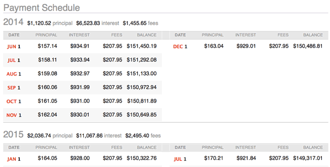
An amortization table of remaining loan payments is shown here with the payments grouped by year. Each payment shows the date on which it is due; the amount of principal, interest, and fees covered by the payment; and the resulting loan balance after the payment is processed. The total amount of principal, interest, and fees paid each year are also shown. To adjust the payment schedule, interest rate, or other loan features, choose Account > Show Loan Settings.
Interpret the summary report for investment and 401k accounts
Account value
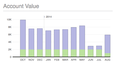
A bar chart is shown here depicting the monthly value of the account. The green portion of each bar indicates the amount of cash in the account, and the blue portion indicates the market value of securities held in the account. The values used for each bar correspond to the last day of the month in question. Hover the mouse over a bar to view the month, year, cash amount, and investment amount it represents. The number of months displayed will vary depending on the width of the main window.
Summary
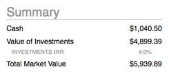
A table is shown here with four figures that summarize the account's value:
- Cash: The value of money in the account that has not been invested in any securities.
- Value of Investments: The current market value of the securities held in the account, based on the latest available security quotes.
- Investments IRR: The internal rate of return is a measure of the profitability of all the securities held in the account, and can be used to compare the relative performance of investment accounts. It is equal to the discount rate that makes the net present value of all cash flows (both positive and negative) from the securities equal to zero.
- Total Market Value: The combined value of cash and investments in the account.
To calculate the market value of each security, iBank obtains a price from the security's price history for the current date. When today's price is not recorded, the price from the closest available date is used instead.
Positions
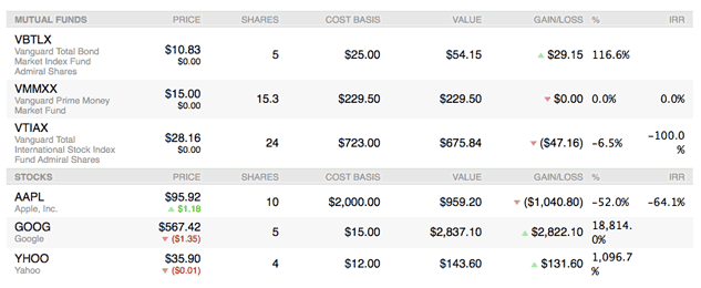
Below the account value chart is shown a table of the security positions currently held in the account, grouped by type. For each security, the name and symbol are displayed, followed by the current price, change in price since the previous close of market, number of shares held, cost basis, current market value for all shares, overall gain or loss since the previous close of market, percentage gained or lost, and internal rate of return.
Risk allocation and type allocation
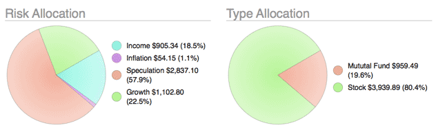
Two pie charts are shown here depicting the shares of each security you currently hold in the account. The chart on the left shows a breakdown of shares by risk level; the chart on the right shows a breakdown by security type. Each pie slice represents the total market value of the shares of a particular risk or type, and the slices are drawn proportionally so that you can see which types of accounts are worth more. Next to each chart is a key that shows which colors correspond to which risks and types, the value of each slice, and the percentage of the total value represented by the slice.
Print or save a copy of a report
Account summary reports can be printed simply by choosing File > Print and clicking the "Print" button. The paper size used for the printout can be changed by choosing File > Page Setup and selecting a different setting, but the orientation is restricted to landscape.
To save a copy of a report as a PDF file, choose File > Print, then click the "PDF" button and choose "Save As PDF." Enter a name for the new file, choose where you want to save it, and click "Save." You will then have a copy of the report that you can view and print using the Preview application or any standard PDF reader.